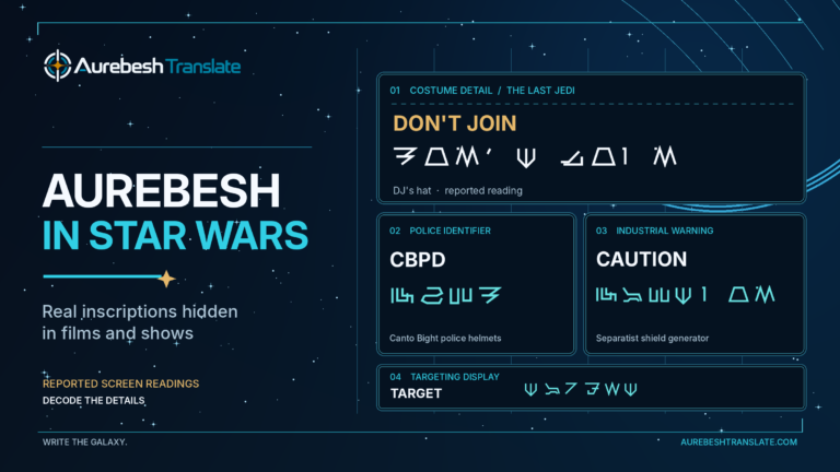
How to Write Aurebesh: A Practical Guide to Star Wars Lettering
To write Aurebesh, start with the word you want to spell, replace each Latin letter with its matching Aurebesh character, and draw those characters in the same order. You can do this with pencil and paper; the important skills are making the shapes accurately, keeping the lettering legible, and preserving the original spelling.
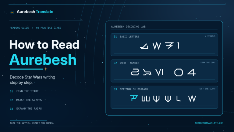
Aurebesh uses 26 basic letterforms and eight optional two-letter characters. You do not need to memorize the complete set before writing your first word. Keep the interactive Aurebesh alphabet beside your paper so you can check each shape as you draw it.
Set Up Your First Line of Aurebesh
Use a pencil, an eraser, and ruled or squared paper. Start with a short word rather than a whole sentence. A light upper guide and baseline help keep angular characters at similar heights; on squared paper, you can use the same number of squares for the height of each letter.
Write the intended word in ordinary Latin letters above your working line. Leave enough room underneath to draw its Aurebesh equivalents. At this stage, copy the whole outline of each symbol, including small bars and diagonals. Those short details often separate one character from another.
The reference chart shows which shapes to use. It is not a prescribed handwriting stroke-order chart: there is no single universally established sequence of pen strokes for drawing every Aurebesh character. You may use several strokes for a complicated glyph if that produces a cleaner result.
How to Write Aurebesh by Hand, Step by Step
- Spell the text first. Write the exact name, word, or message in Latin letters. Keep repeated letters, spaces, and any numbers you want in the finished version.
- Choose one reference style. Use the same Aurebesh chart or font specimen throughout the piece. Avoid switching between different designers’ letterforms halfway through a word.
- Match each letter to a glyph. Look up the Latin equivalent, then draw the corresponding shape in the original order. Do not substitute a symbol simply because it resembles its English counterpart.
- Build the outline with light strokes. Put the main vertical and diagonal lines in place first, then complete short crossbars, branches, or corners. This is a practical drawing method, not a canonical rule about which stroke must come first.
- Leave clear space between words. Keep the spacing between letters consistent enough that adjacent glyphs do not merge into an accidental new shape.
- Check the spelling before darkening the lines. Compare the written glyphs with the reference and work back through the original Latin word. Correct any reversed or missing strokes while the pencil lines are light.
For a beginner, precision matters more than speed. Five correctly formed letters are better practice than a full page copied without checking the shapes.
Trace, Copy, Then Write: A Five-Letter Exercise
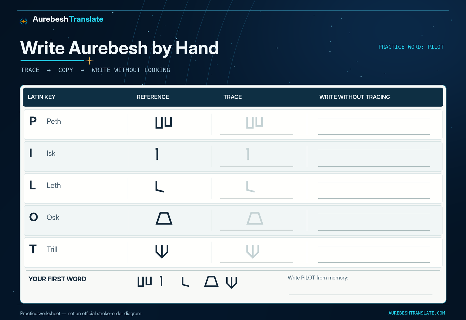
Practice with PILOT, a word containing five different basic Aurebesh letters:
P → Peth · I → Isk · L → Leth · O → Osk · T → Trill
The practice sheet below uses the actual glyphs from the site’s AurebeshTranslate Regular font. Each row gives you a dark reference, a lighter version to trace, and empty space to reproduce the character yourself. The bottom line places the five letters together as a word.
First Pass: Follow the Form
Trace each lightly printed glyph slowly. Notice where a line ends, where two lines meet, and whether the shape is open or closed. Do not round off every sharp corner simply because a curved movement feels easier with your pen.
Second Pass: Copy Without Tracing
Use the blank space beside each example to copy it while looking at the reference. Aim to retain the distinctive geometry rather than imitate the exact line thickness of a digital font. A handwritten glyph can be less mechanically perfect and still be identifiable.
Third Pass: Write the Whole Word
Cover the reference row and write PILOT from memory. Compare your result with the sheet afterward. If one symbol is uncertain, practice that symbol individually before rewriting the whole word. This tests whether you have learned its form instead of just following the printed strokes.
Keep Similar-Looking Letterforms Distinct
Certain characters are easy to distort during handwriting. In the AurebeshTranslate typeface used here, Osk (O) has a four-sided, trapezoid-like outline, whereas Xesh (X) has a triangular one. Closing the wrong corners can make them easier to confuse. Peth (P) and Usk (U) have related upright structures, but their internal details differ; make those details visible rather than reducing both to a generic U-shape.
Pay particular attention to characters with short marks. An otherwise accurate outline can become difficult to identify when a small bar disappears into a thick pen stroke. Check the glyph at a larger size in the alphabet chart if you cannot see how its parts connect.
Letter Height and Spacing
Start with approximately equal letter heights and allow widths to vary with each shape. You do not need to force every glyph into a square of identical width. Keep a clear gap between adjacent characters; for words, leave a noticeably larger gap, roughly the width of a typical letter as an initial guide. Adjust by eye once the complete line is visible.
A useful finishing test is to put the page down and look at it from arm’s length. If two characters seem joined or one short stroke disappears, increase the spacing or redraw that detail before inking the design.
Write a Full Label: NORTH GATE 07
Once single words feel comfortable, try NORTH GATE 07. This is an invented practice label, not a transcription from a Star Wars scene. It introduces two words, an optional digraph, and a number while keeping the wording manageable.
Start by dividing it into three groups:
| Group | Basic-letter writing plan |
|---|---|
| NORTH | Nern · Osk · Resh · Trill · Herf |
| GATE | Grek · Aurek · Trill · Esk |
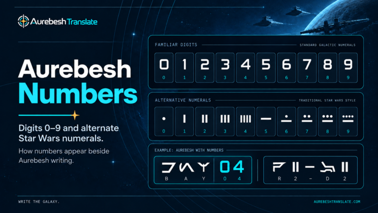
| 07 | Write the digits 0 and 7 in your chosen numeral style |
For the first attempt, draw NORTH using five separate letters. That gives you a direct match between the Latin spelling and the five glyphs you need to make. Then write GATE and preserve the space before 07. The leading zero matters if 07 is being used as an identifier.
For a second version, replace the final T + H in NORTH with Thesh (TH). You now write N + O + R + TH—four letter glyphs representing the same five Latin letters. Both versions retain the spelling NORTH. The Aurebesh digraphs guide covers the complete set of eight combinations; when practicing by hand, choose whether to use them before laying out the line.
If the label feels cramped, write NORTH GATE on the first line and 07 below it. Keep each group’s letters in order. A line break changes the layout, not the spelling.
Capital Letters, Mirrored Shapes, and Punctuation
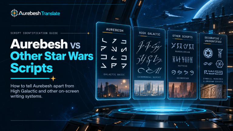
Ordinary Aurebesh has no universally required uppercase-versus-lowercase distinction comparable to the two sets of English letterforms. Some fonts and productions use mirrored characters as a stylistic way to show capitals, but that is not a rule you must apply when hand-lettering a name or sentence.
For a consistent beginner’s result, draw the regular character shape for each letter. To emphasize a heading, use larger lettering, more space, or stronger line weight rather than introducing flipped symbols at random. The site’s own font maps uppercase and lowercase Latin input to the same basic Aurebesh shapes; it does not automatically mirror capitals.
Keep normal word spaces and any meaningful punctuation. A hyphen in a code or a period at the end of a statement is part of the written message. Number design is less uniform across Star Wars material, so if you want something other than familiar 0–9 digits, check the Aurebesh numbers reference before drawing unfamiliar numeric marks.
In ordinary horizontal writing, arrange the characters from left to right. If you are reproducing a specific curved, stacked, or reflected inscription, study that source separately instead of assuming its presentation is a universal handwriting convention.
Writing Names and Longer Messages Accurately
A personal or fictional name should be spelled as intended before you choose its glyphs. For example, different spellings that sound similar can produce different Aurebesh lettering. Write what the name actually says on the page, not what you think it sounds like. If a name is normally written in a different writing system, establish the Latin-letter spelling you want first; Aurebesh’s traditional chart does not provide a dedicated character for every script or accented letter.
For a longer message, draw a light layout first. Decide where words will break, leave room for punctuation, and pencil in the widths of the longest lines. Repeat letters using the same form each time. A sign with consistent spacing and deliberate margins will look more coherent than one that forces the final word into whatever space remains.
This emphasis on readable names is consistent with actual production lettering. StarWars.com notes that the racer in Star Wars Resistance carried SPEEDSTAR written in Aurebesh along its nose, with an S character used elsewhere on the craft. The official production note is a useful example of lettering designed to communicate a specific name, rather than random decoration.
Check a Finished Inscription Before You Ink It
Before going over a pencil draft in permanent ink, inspect it in the opposite direction from the way you created it: look at each written Aurebesh character and write its Latin equivalent beneath it. This catches missing strokes, repeated or skipped letters, and mistaken pairs without relying on your memory of what you meant to write.
For a second check, type the original text into the Aurebesh translator and compare the displayed glyphs with your draft. Use the same digraph choice when comparing. The tool shows a rendered reference; it does not scan your handwriting or certify that a drawing is accurate. If one handwritten shape remains ambiguous, the individual character view in the alphabet reference is the better check.
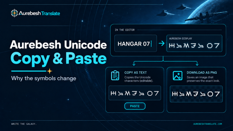
If you would rather compose lettering digitally than draw it by hand, the Aurebesh keyboard allows manual text entry and PNG export. For editable lettering in compatible desktop programs, see the Aurebesh fonts resource.
The most effective writing practice is a small repeatable cycle: trace a correct shape, copy it while looking, write it from memory, and verify the result. Once individual letters become reliable, complete words and cleanly spaced signs follow naturally.
Author: Austin Miller
Editorial standards: AurebeshTranslate.com Editorial Policy