History of Aurebesh: How the Star Wars Alphabet Was Created
The history of Aurebesh begins with a few seconds of unfamiliar lettering on a Death Star computer screen. Those symbols appeared in Return of the Jedi (1983), but the readable alphabet familiar to Star Wars fans was developed a decade later by graphic designer Stephen Crane for West End Games. Crane devised the character mappings in 1993, and the alphabet was published in the Star Wars Miniatures Battles Companion in 1994.
That distinction matters. The film supplied visual inspiration; the game book supplied a writing system that people could use to spell actual words. Subsequent publications and screen productions expanded its role, eventually making Aurebesh one of the most recognizable elements of written communication in Star Wars.
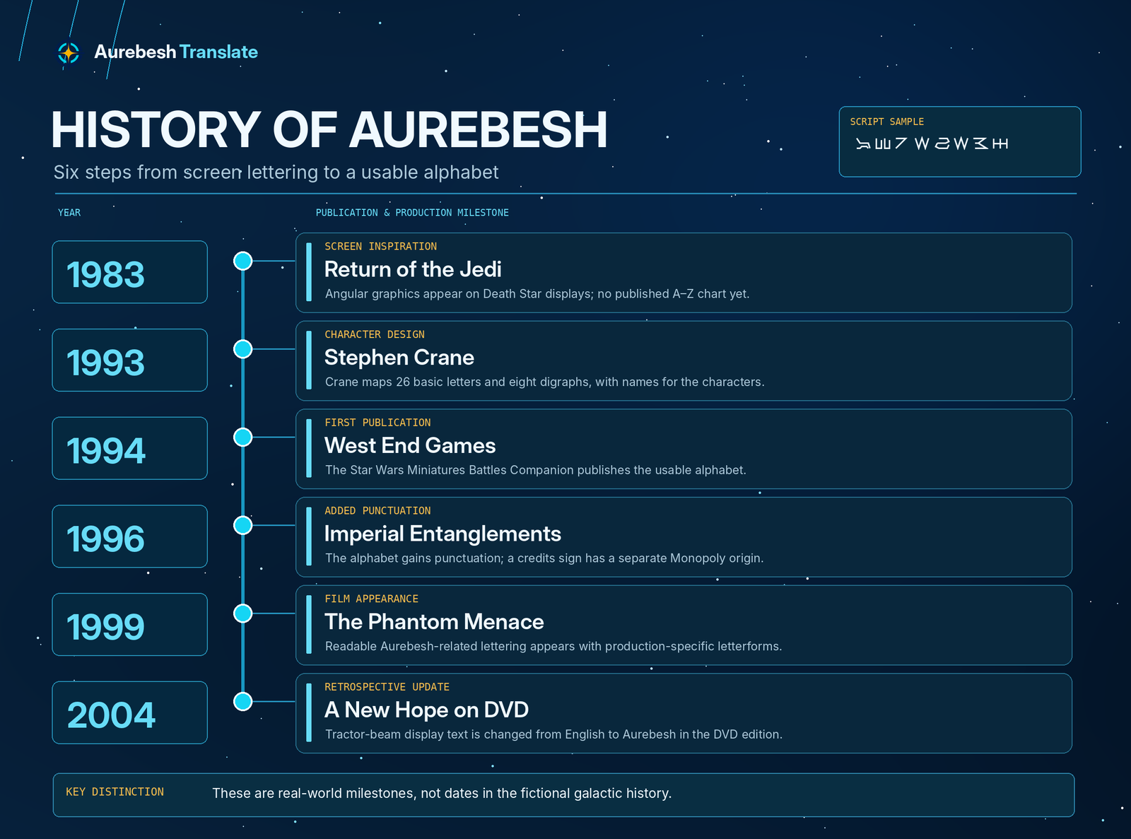
Aurebesh History at a Glance
| Year | Milestone | Why it matters |
|---|---|---|
| 1983 | Unfamiliar lettering appears on Death Star displays in Return of the Jedi. | Establishes the visual source that inspired the later alphabet. |
| 1993 | Stephen Crane develops a named, mapped Aurebesh character set. | Turns the screen-inspired symbols into usable writing. |
| 1994 | West End Games publishes Aurebesh in the Star Wars Miniatures Battles Companion. | Gives players and designers a consistent reference. |
| 1996 | Imperial Entanglements adds punctuation; Star Wars Monopoly contributes a separate credits symbol. | Extends the visual vocabulary beyond the original letters. |
| 1999 | A readable Aurebesh-related variant appears in The Phantom Menace. | Brings meaningful alphabet-based screen text into a theatrical film. |
| 2004 | The DVD edition of A New Hope replaces English tractor-beam display text with Aurebesh. | Shows the newer alphabet being applied retrospectively to an older film. |
These are real-world production and publication dates, not dates from the fictional history of the Galactic Republic or Empire.
Before There Was a Readable Alphabet: Return of the Jedi (1983)
When Darth Vader’s shuttle approaches the second Death Star in Return of the Jedi, computer readouts show rows of angular, illuminated symbols. They help the display look like technology belonging to another civilization. The visible markings were brief pieces of screen design, not a published character chart.
The distinction is easy to miss today because later Star Wars productions contain messages that can be decoded using familiar Aurebesh letters. Applying those later mappings to the original Death Star readouts, however, does not reliably produce meaningful instructions or sentences. The early graphics were made for their appearance, not as a systematically encoded message.
That gave Crane an unusual starting point: a recognizable visual style already existed, but its relationship to the Latin alphabet had not been established for readers. He could preserve the feeling of the film graphics while giving individual symbols consistent identities.
Stephen Crane’s 1993 Design: From Shapes to Letters
Stephen Crane was working on material for West End Games’ Star Wars Miniatures Battles when he developed Aurebesh. His intention was practical. Players could decorate miniature figures, military units, scenery, and game handouts with lettering that looked as though it belonged in the Star Wars universe.
Assigning Characters to the Latin Alphabet
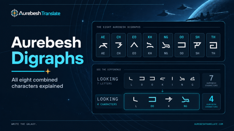
Crane drew on shapes inspired by the Death Star display and assigned equivalents for the 26 Latin letters. He also established eight additional characters for two-letter combinations: AE, CH, EO, KH, NG, OO, SH, and TH.
These additions made a 34-character repertoire, but the paired forms were alternatives to writing two ordinary letters separately. The Aurebesh digraphs guide explains how those choices affect written words; historically, their significance is that they were part of the early design rather than a recent addition made by digital translators.
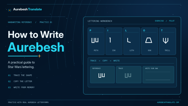
Crane named the symbols as well. The first letters became Aurek and Besh, yielding the name Aurebesh. Names such as Cresh, Dorn, and Esk gave the chart an internal identity beyond a simple set of substitutions.
Reproductions of an early Crane chart carry a date of August 26, 1993, together with a FreeHand 3.1 notation, a reminder that this familiar fictional alphabet also began as real graphic-design work.
Why a Miniatures Game Needed an Alphabet
West End Games’ tabletop material depended heavily on visual details: insignia, organization markings, vehicles, and scenery. A coherent alphabet let creators produce fresh labels instead of repeating a few arbitrary shapes from the films.
It also gave players a consistent way to create their own markings. The same character could represent the same letter on different objects, making the designs recognizable without requiring a new language or dictionary.
The result was a practical visual resource that could be reused far beyond the game for which it was conceived.
The First Published Aurebesh: 1994
The alphabet appeared in the Star Wars Miniatures Battles Companion, published by West End Games in 1994. This is the key date for Aurebesh as a publicly available, systematic writing reference, even though Crane had created the design the previous year.
The book presented the alphabet in connection with unit insignia and organization. Its purpose was to help give tabletop forces and settings a distinctive Star Wars appearance. The characters were not introduced as a historical discovery about a real language; they were a designed system for making fictional-world text consistent.
The transition from a film graphic to a printed alphabet changed what other creators could do. Anyone with the chart could construct a new label by matching letters rather than copying a pre-existing picture. The published mapping also gave later fonts and references a shared foundation.
For the full set of character names and shapes, the site’s Aurebesh alphabet reference preserves that basic lookup function in an interactive form.
The 1996 Expansion: Punctuation and the Credits Sign
The original mapping concentrated on letters and the eight digraphs. In 1996, Crane expanded it with punctuation for Imperial Entanglements, another West End Games supplement. Punctuation made the script better suited to longer messages where sentence structure mattered.
A related detail from the same period is often mistakenly folded into Crane’s original alphabet: the credits currency sign. That symbol came from Parker Brothers’ Star Wars Monopoly, rather than from the 1993 letter design. It belongs to the history of Aurebesh-related typography, but its origin is different.
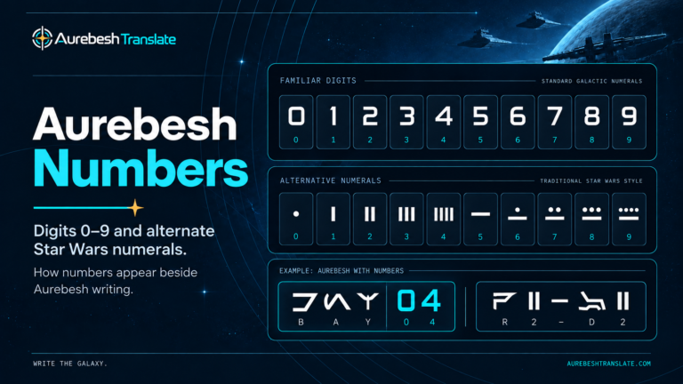
Numbers have a separate story too. Crane did not develop an original set of dedicated digits alongside the 34 letters; familiar decimal numerals already appeared on the film displays that inspired him. Later dot-and-line numeral designs came from other Star Wars material. Our Aurebesh numbers article traces that distinction without treating all numeral styles as one original alphabet.
Together, these developments show why a modern Aurebesh chart may contain more than Crane’s initial 34 characters. Extra marks can be useful and historically documented without all having been created at the same time or by the same designer.
How Aurebesh Returned to Star Wars Screens
Aurebesh’s movement from game publications into film production was not a simple matter of one unchanged font being adopted everywhere. Screen artists used variations, and even established characters could be mirrored or redrawn.
The Phantom Menace (1999)
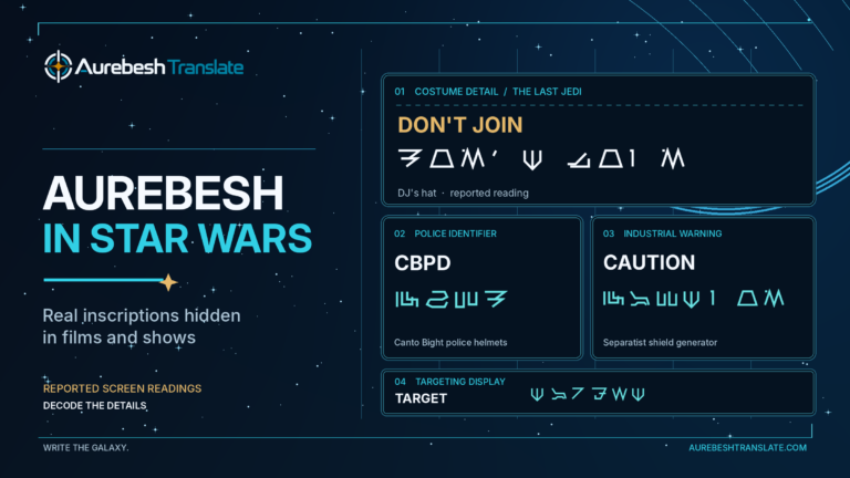
In Star Wars: Episode I – The Phantom Menace, lettering appears on the display of Anakin Skywalker’s N-1 starfighter during the Battle of Naboo. R2-D2’s message telling Anakin to turn the ship around is an early example of readable, Aurebesh-related text in a theatrical Star Wars film.
The glyphs are not identical to every character in Crane’s original chart. Some forms differ or are reflected. That makes the scene historically useful: it shows the emerging writing system returning to the screen, while illustrating how production-specific typography could diverge from the published reference.
The 2004 DVD Edition of A New Hope
In the original 1977 release of Star Wars, the Death Star tractor-beam control display seen during Obi-Wan Kenobi’s mission used English lettering. In the 2004 DVD edition, the visible control-panel wording was changed to Aurebesh.
This was a retroactive production change. It does not mean that the standardized Aurebesh alphabet existed when the 1977 scene was filmed. Instead, it shows the later writing system being used to make an older screen detail fit the developing visual language of Star Wars.
Its appearance also was never entirely uniform. An official StarWars.com set-diary retrospective on Revenge of the Sith recounts cockpit labels written in ordinary English rather than Aurebesh. The record is a useful reminder that production design choices varied, even after the alphabet was established.
Real-World Origins Versus Fictional Galactic History
Two different questions are sometimes confused: Who designed Aurebesh for Star Wars? and Where did Aurebesh originate within the Star Wars universe?
The first has a documented production answer: Crane developed the mapped alphabet in 1993 for a West End Games publication released in 1994, drawing on earlier movie graphics.
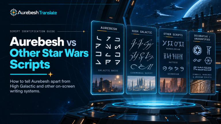
The second belongs to fictional world-building. Later Expanded Universe writing supplied in-universe explanations for the development and spread of different galactic scripts, sometimes connecting Aurebesh to much older civilizations. Those accounts describe the galaxy’s imagined past; they are not alternative evidence about who designed the real alphabet or which publication first introduced it.
This distinction also helps explain why Aurebesh can appear in stories set thousands of years before the Galactic Civil War. A script can have an ancient fictional history while having a much more recent real-world creation date.
What Remains from Crane’s Original Alphabet Today?
The most durable part of Crane’s work is the relationship between named glyphs and Latin letters. Modern typefaces may use different stroke weights, spacing, mirrored forms, or optional digraph settings, yet the core chart still provides a recognizable basis for reading Aurebesh.
Its influence extends to the tools people use now. A desktop font makes the letterforms practical for editable documents, while a browser-based converter makes the mapping accessible without installing one. Our Aurebesh translator uses that familiar writing system to display text, connecting a digital tool to a design history that began with a Death Star display and a tabletop-game supplement.
The history is most accurately understood as a series of separate but connected developments: screen inspiration in 1983, systematic design in 1993, publication in 1994, added punctuation in 1996, and expanding screen use in later years. Keeping those stages distinct explains both why Aurebesh is recognizable and why not every version of it looks exactly the same.